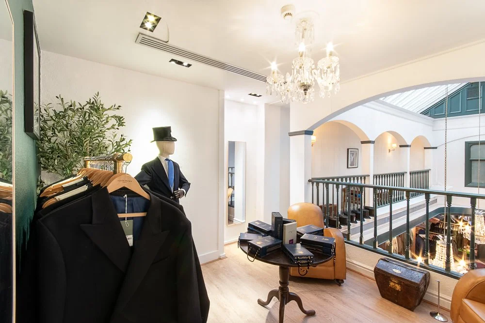
Commercial photography isn't just about shoot day—sometimes the real magic happens in post-production. This Chester store shoot presented a technical challenge I thrive upon: photographing a historic Rows building with complex mixed lighting, protected features, and mid-winter drizzle, all whilst matching the clean, bright aesthetic of modern London stores. A deep dive into exposure blending, collaborative problem-solving, and what commercial photography really looks like.
5 Photographs every business/brand needs Part 1
#1 - Headshot
A good quality headshot will:
👩💼 Introduce you/your team personably in a digital world
👨💼 Increase the speed of the know-like-trust journey
👩💼 Make a connection (eyes are the gateway to the soul)
👨💼 Increase your confidence
👩💼 Show personality and set the tone for DM conversations
👨💼 Help clients locate you confidently when you first meet in person
As you plan your next quarter - do you need to consider scheduling headshots?
I know - it's snowing - so you are probably not thinking about outdoor photography unless you are an outdoors pursuits instructor or absolute lover of the winter Golden hour, but I digress...
As we head towards spring why not get booked in for the first greening of the leaves and beautiful blooms?
Need a headshot sooner?
Lizzy Biggs Photography can provide a portable studio set up with backdrop/lighting
We also can travel to you and turn your office/desired location into a personalised background giving you a distinctive edge!
All enquiries are welcome. Call Elizabeth on 078 7843 7843, email Info@lizzybiggs.co.uk or visit https://www.lizzybiggs.co.uk/headshot for more information.
Natural foliage provides a soft background
One of the fun things about photographing an event is that you get to work with (and sometimes even sample) the fabulous services of other providers!
Let’s face it, there is always a risk at a commercial event that buffets can be drab, dry and leave you wanting more, prepped and left for far too long.
This was far from the case with Wild Flour Food Company who put on the most colourful spread I’ve ever witnessed on a building site!
Rhiannon and the team put on a colourful and fresh homemade spread including sausage rolls, tangy cheese & tomato pinwheels, satisfying sandwiches, quiches, vegan wraps, crunchy veg with creamy dips and more!
Everyone was spoilt for choice. After the Lord Mayor, Chester councillors, Elliott Group and Thrive Living retirement representatives sampled the sumptuous selection the local building contractors enjoyed full plates and hearty portions.
And then there were deserts!
Would you choose the healthy fruit platter, classic afternoon strawberry scones, traditional sticky toffee cake with a twist, or dreamy dense chocolate brownie?
So if you are booking an event in the Chester and North Wales area, and need a caterer who brings fresh local ingredients, fabulous flavours and who doesn’t skimp on portions, I can highly recommend Rhiannon and the team at Wild Flour Food Co.
You can contact them on the following channels:
Website: https://www.thewildflour.co.uk
Facebook: Wild Flour
Instagram: @thewildflourfoodco
The lads appreciated the spread too!
Keep an eye out for the next post for shots of the retirement village…
Also if you are looking for Photography at your corporate or commercial event in Chester or North Wales don’t hesitate to reach out - I’ll be happy to take your call personally on 078 7843 7843!
Elizabeth (Lizzy Biggs Photography)
November was all about advanced composition techniques: Maths and Science help us to understand the natural world and create more impactful art and science. Today I cover just a few of those techniques!
Colour is all around us, the clothes we wear, the cars we drive, the scenes in nature, cityscapes and decor, and used to help us differentiate:
We respond subconsciously to them without realising - making associations.
Colour is powerful and can change the whole way people perceive you and your business, your product, your service and your offering.
Understand the POWER of how we see colour:
Our eyes interpret the data we see visually far before we read – for example the stop sign. Although this varies from country to country, we are very aware that RED is a warning. The red stands out, and we are conditioned to pay attention.
The Brain and Colour
In the same way, when looking at marketing, business cards, social media posts, tv and every other form of visual input around us, our brain is speeding up our ability to scan for what is of importance.
What should it pay attention to?
Then second it is defining how to interpret the visual signals and give swift context to anything we do then value enough to read.
Colour Associations
Some associations are generic, they are interpreted quite unanimously across the board.
For example, most people see green in nature and associate it with growth and new life, as green comes with the rains or in spring
Some colour associations are still well understood but contextual.
The way we see red can depend upon context:
At valentines time of year red fonts evoke feelings and understanding of love and passion as do hearts all year around.
Red rag to a bull / red mist / red blood drops - all evoke connotations of anger or pain
Yet red used in spray paint or an anarchy symbol does neither and instead associates with rebellion or freedom fighting.
Some colour associations are cultural. The above example where red is used for danger and attention may be more specific to the West or Middle East.
Alternatively, far Eastern cultures may see red associated with prosperity. Then conversely, I may associate prosperity more with the Western green of money, and in the Middle East with yellow.
Some colour associations can also be personal.
For example, if I saw my mother as truly beautiful and encouraging and she always wore blue, I may, at a subconscious personal level, associate blue with safety, maternal love or homeliness.
So, if colours mean different things to different people, how do I choose my brand colours?
Ultimately, while the science behind colour theory could be studied for years, unfortunately, there are no hard and fast specific rules for choosing your brand colours.
It would be unfortunate if you were looking for me to give you a rule-based script you could enter into ChatGPT or another AI engine of choice to compute what your personal colours should be for your brand.
The Easiest Route…
The easiest route would be to select your favourite colour and call it done.
This isn’t a bad starting point for a small business which only needs to connect with a handful of clients, especially where you do a lot of the marketing personally with your face.
I would suggest, however, that the larger you get and the more you need to market outside of personal networking and 121 conversations, the more important not only brand colour choice but also specific brand shade/saturation/tonality will become.
Colour Science, Psychology & Symbolism
Now it is time to delve into the science of colour and consider a few more factors like subconscious understanding and creating maximum resonance between your brand and the ideal client right down to the details of where you will use those colours.
Which additional palette colours you select will be used in which applications and contexts, to accent, highlight and accentuate with uniformity across your entire visual suite.
Keys for creating a unique, identifiable and attractive brand palette
I do have a number of keys which I suggest taking into account when selecting your complete brand palette.
These keys can be unlocked with the following questions, and don’t worry, I will dig into the why and how to answer them in greater depth later on:
What colours do you appreciate and personally resonate with?
Do your ideal clients also appreciate these colours, or is your personal taste different?
What are your direct competitors’ colours?
Which colours do colour symbolism and psychology suggest align with your brand values?
Which colours do colour symbolism and psychology suggest align with your sector and niche?
According to colour theory, which secondary and tertiary colours have a good relationship with your chosen primary colour?
Which colours relate well to your primary colour (e.g. harmonising, analogous, triadic, complimentary etc…) best fit your brand values, message, sector and niche?
I’ve chosen My Colours: what next?
I love this part of the process!
Once you have chosen your exact tone, shade and saturation of colours you get to take a digital swatch necessary to generate the relevant hex codes and RGB/CMYK values for your brand guide.
Your brand guide containing these codes and values (and also fonts and other design assets like your logo) is important. It’s what you will need to guarantee uniformity across digital and printed media, to keep that brand look you are working so hard to achieve.
You can then supply them to your campaign marketer, graphic designer, or photographer.
Or if you are very creative or have an in-house creative team, you can go DIY in content creation and add them to your Canva palette (for your marketing templates and graphics) or within Adobe design suite.
So to conclude:
Colour is powerful evoking emotion and sending subconscious signals
Choosing colours correctly will help you stand out from your competitors, resonate with ideal clients and strengthen your brand image.
There are a number of things to consider when choosing which relate to the psychology and symbology of colour. Colour theory can help you select your palette.
To make use of your palette you need colour values and codes to replicate seamlessly across both your digital and printed presence.
Coming next:
Colour theory for business & utilising Elizabeth’s brand colour keys.
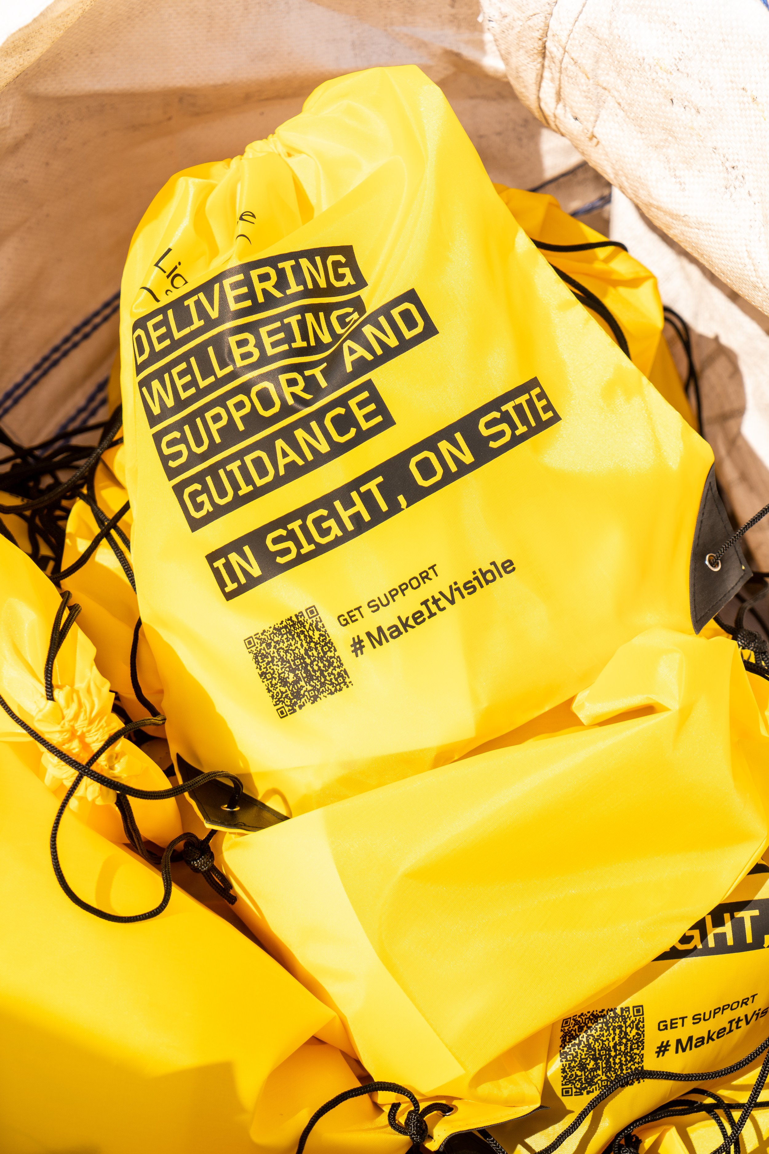
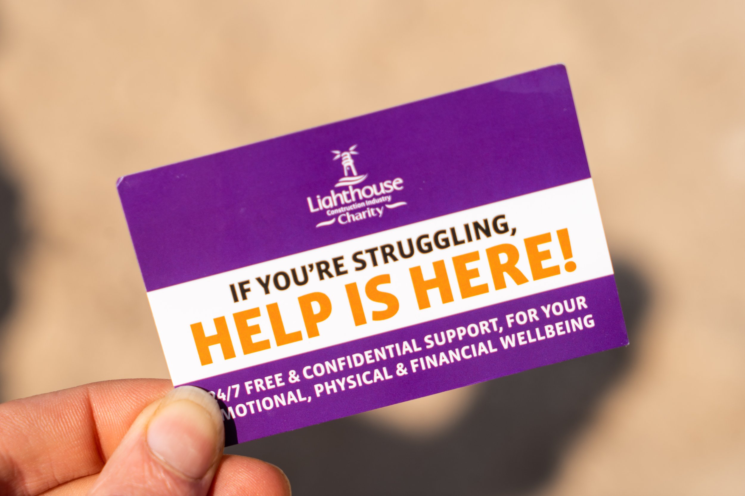
Earlier this year I got the privilege of listening to the training/support talk by the brilliant Lighthouse Construction Industry Charity at the Elliott Group construction site in Thrive Living Retirement Village Great Boughton Chester - while photographing the event.
Ian Hines and his colleague from MYHP - The Mental Health Podcast came on-site and gave a superb presentation for the charity to all the contractors, staff (and even myself) on the impact of mental health and family life events upon work, home life and health.
It's amazing how life events can impact anyone at any time.
This week Elliott Group announced they have become an official company supporter of this superb charity so I thought it was a good reason to share a few of the photographs I captured of the Lighthouse Construction Industry Charity.
You can see them here in full flow reminding us it's not weak to get help - it may even save your life - ESPECIALLY if you've hidden how bad things have got and nobody else is aware!
While things are good it's so easy to think it will never be me, but I can testify how much life can change.
Simply getting out of bed and eating becomes a challenge when life gets the better of you.
Perhaps you have had a huge capacity and carried many many responsibilities and juggled a lot successfully your entire life, but then that one additional pressure (that proverbial straw) causes rock bottom to fly fast at your face!
This doesn't mean you are useless. There is strength in vulnerability.
So I wish you all a great week, and if you need it speak to someone... Get help, there will be charities and support services out there for you too even if you can't utilise this fabulous charity for anyone in the construction industry!
#makeitvisible
3 tips to create fun media for your marketing with photography…
The three things you need to know taking headshots at home on your mobile phone about lighting and where to stand - this will drastically change your results!
Projects 1, 2 and 3 - to do with children
Too Busy to Risk Losing Photographs:
I imagine you, like most people, have never really considered what you might lose if your phone gets stolen apart from perhaps the obvious - your phone - and the next thing to cause fear - your contacts and banking information.
What about the repercussions if your computer or laptop dies? Well, the obvious question of how can you work from home or a coffee shop when you lose that vital tool and the challenge of emails get more tricky on a mobile.
But you probably haven’t considered what will happen to all your many, many photographs and files- UNTIL THE FATEFUL MOMENT THE WORST HAPPENS.
I’ll never forget being approached in tears - my screen has cracked and I cannot get my photographs or videos of the first 2 years of my daughter’s life off. I can’t even put on the transfer app to move them to my new phone. They are all gone - I was going to put them on the computer but now it is too late!
Saving/Backing up: I have started recommending my simple system of THREES for protection and backup - save your photos in a minimum of 3 places - because tech can fail!
Last year I thanked God for my backups because never having experienced it before I then had five failures: 2x computer disks, 2x Pendrives 1x memory card!
So remember the simple rule of THREES - save your photos on:
Computer or Laptop or Phone in an assets folder for using and sharing.
Disk or Pendrive or External Harddrive not affected by power surges /outages as an accessible backup incase you move/accidentally delete your photos on your computer.
The Cloud - e.g. Googledrive, Onedrive or paid backup service such as Backblaze not linked to localised issues such as flood/fire/earthquake.
