Store Photography in Chester's Historic Rows: Balancing Heritage & Brand Requirements
The Challenge
Commercial photography isn't just about what happens on shoot day. It's not even just about the planning, recce, and photography brief that come before the shoot. Sometimes (often actually), the real magic happens in post-production, where technical challenges meet brand requirements, needing a pinch of creative problem-solving.
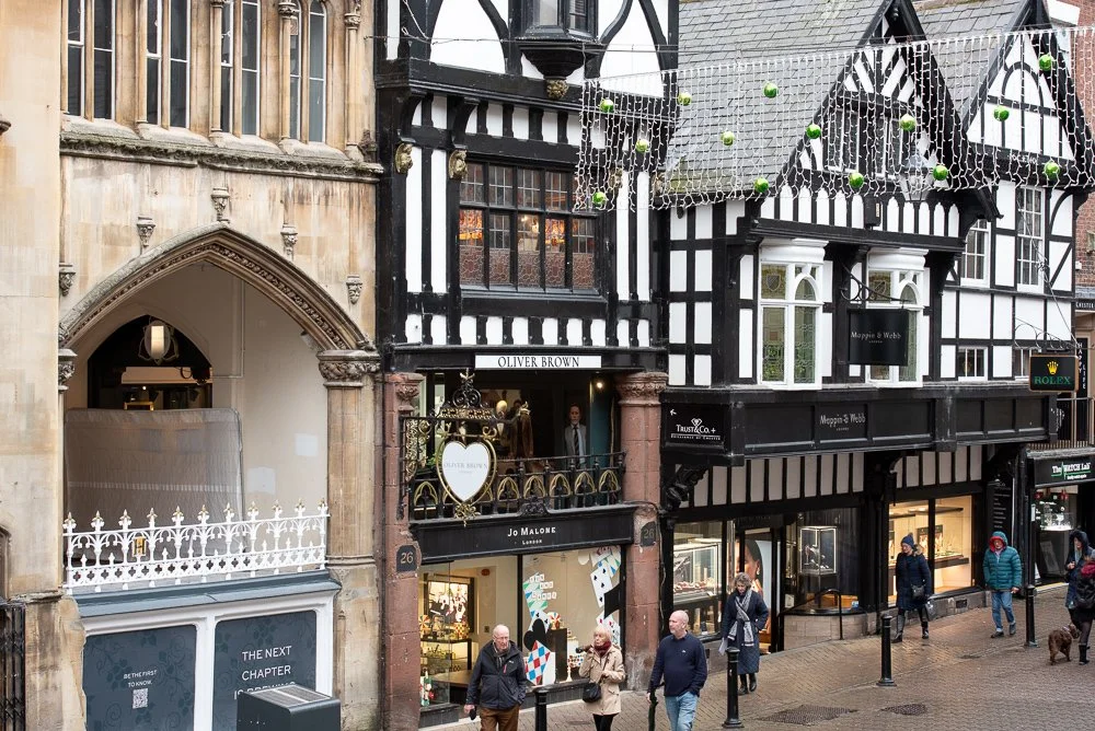
Commercial photography in Chester's historic buildings, like this originally medieval one (with a touch of Gothic glass, Tudor Architecture, Elizabethan Styles, and Victorian influence) on Eastgate Row, presents unique technical challenges. This was a photography project for a clothing retailer needing their historic Chester store to match the bright, modern vibe of their London locations. And if you know us at Elizabeth Biggs Photography, you'll know we love a good challenge.
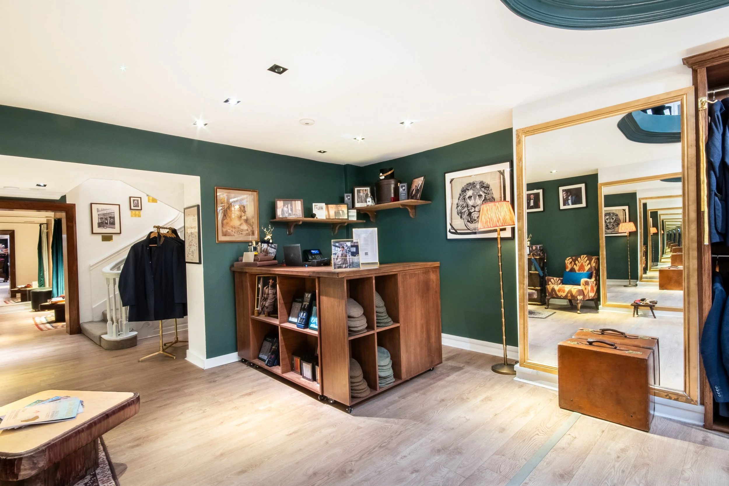
Store Interior Photography - balancing historic features, brand guidelines and complex lighting
Painting the Picture: A Photographer's Dream (and Challenge)
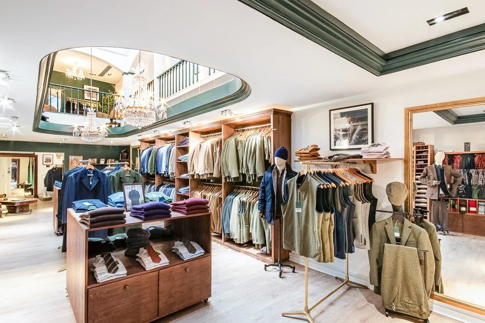
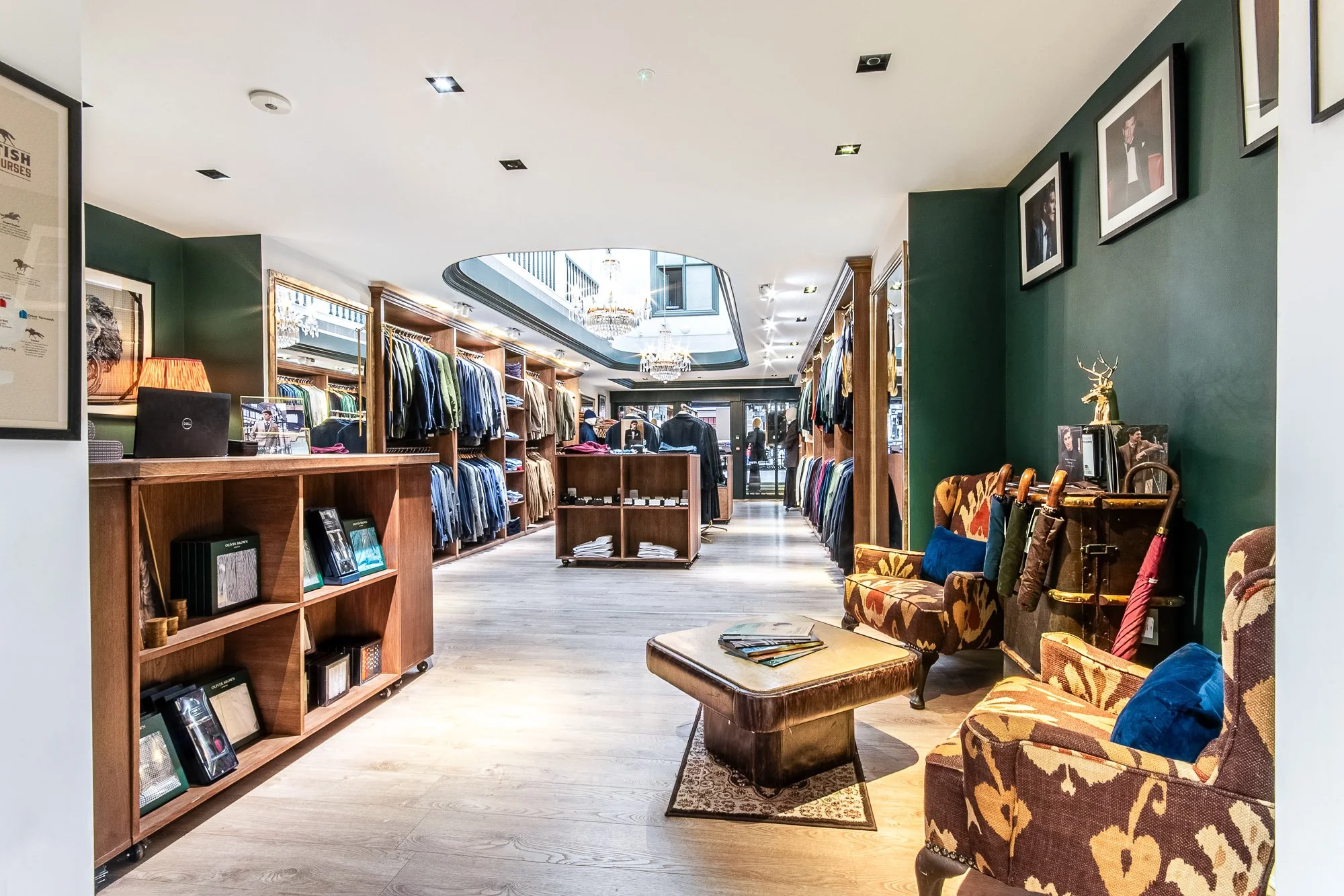
This store is housed in a characterful historic building on Chester's famous Rows – those medieval two-tiered shopping galleries that make the city architecturally unique. This location has everything a photographer could want in terms of visual interest, and everything that makes matching it to a contemporary brand aesthetic... complicated.
Let me paint the picture:
The Storefront: Almost no natural light filters through from the street, thanks to the overhanging atmospheric Rows structure outside the shopfront. The covered medieval walkway that makes Chester so distinctive also creates a beautifully moody, low-light entrance.
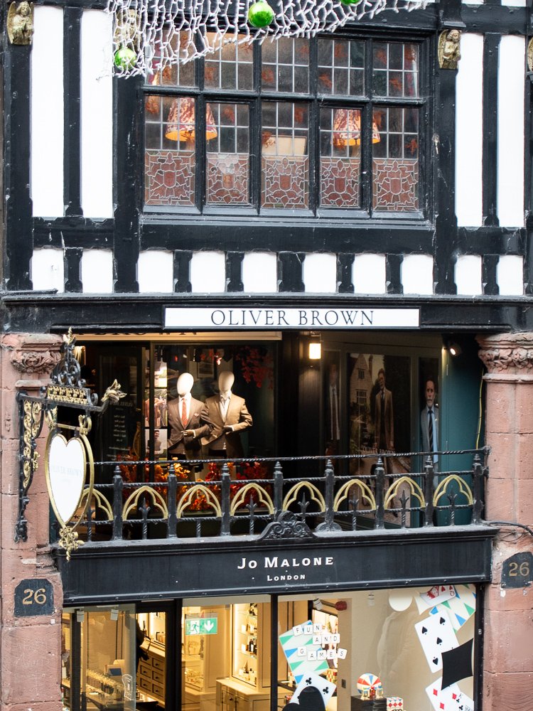
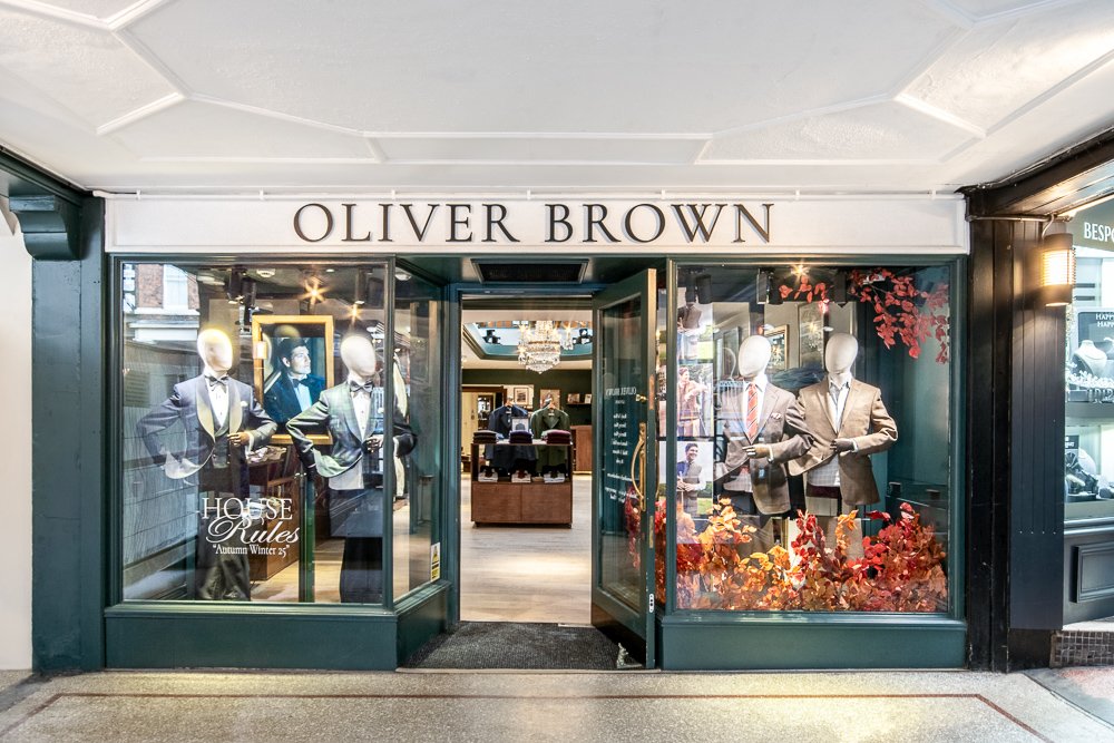
1. Chester’s Rows on a dark, rainy day. 2. The challenge of a shop window under the walkway. 3. The final storefront with a lit and balanced interior.
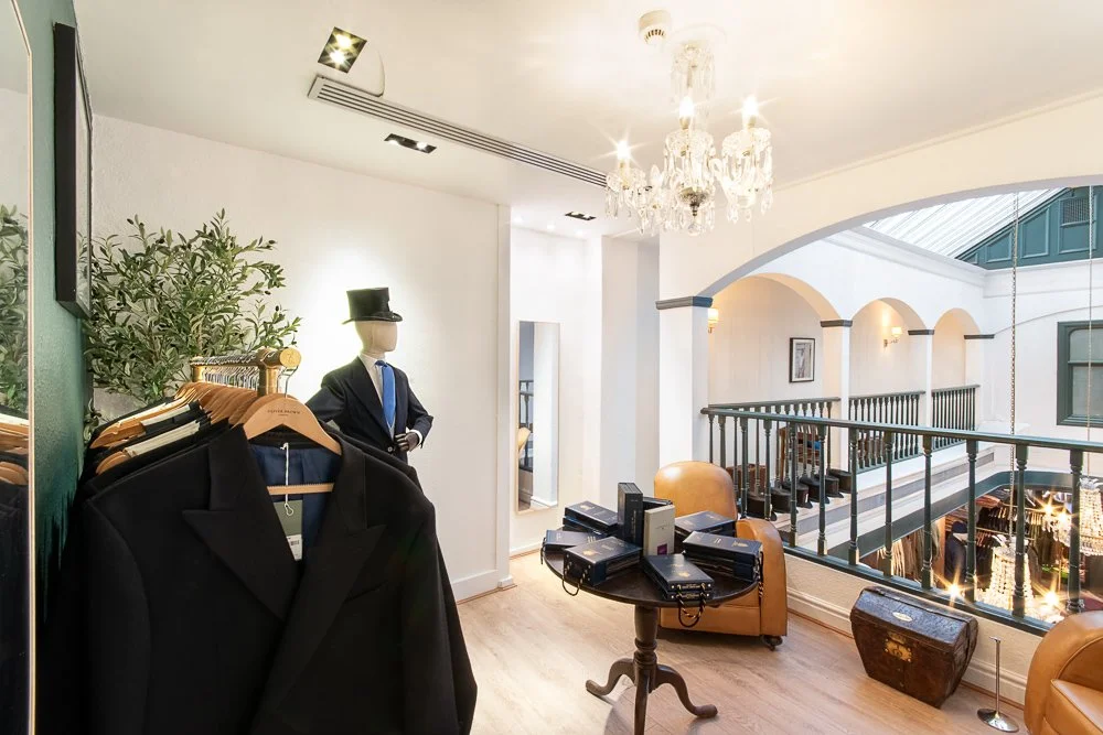
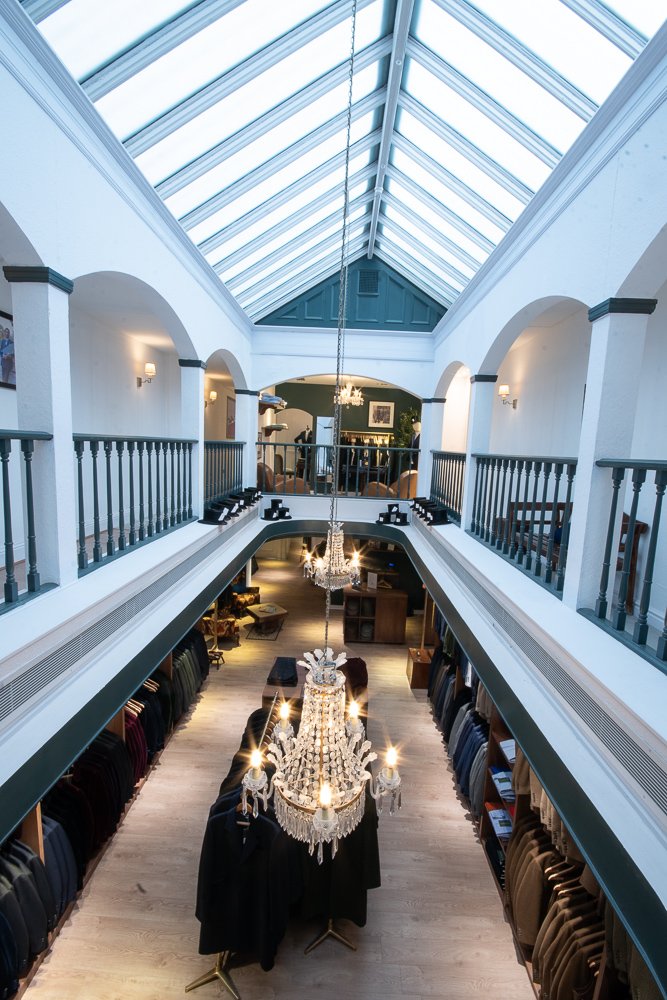
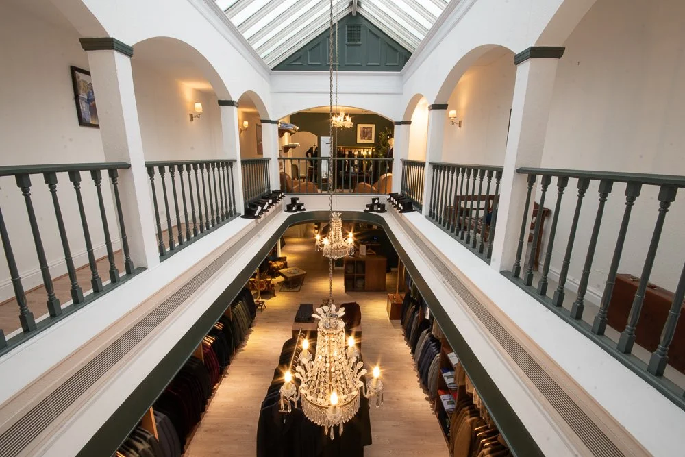
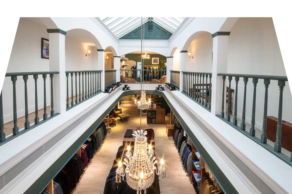
The Main Space: Low ceilings open up into an off-centre Victorian-style conservatory skylight with chandeliers hanging down. This architectural quirk floods part of the space with natural light whilst leaving other areas in relative shadow. It's gorgeous. It's also asymmetrical, which presents interesting challenges for creating balanced, on-brand imagery.
The Colour Palette: Their signature colour appears darker than in most of their London stores, mostly due to adorning vast walls in the low-ceilinged, low-lit areas. This shade shows up dramatically differently depending on the light. In dark spaces, it deepens to something almost moody, absorbing available light. In the natural-light-flooded areas of their other locations, it appears lighter, brightened by blue-tinged midday and early-afternoon light. Photographically? It's like working with two different shades depending on the lighting conditions.
The Timing Challenge: Mid-winter Chester. Classic British drizzle. Even the dull light coming through the overhead skylight had that blue cast, but not enough throw to illuminate the suit’s area on the entrance level. The Oak Room, used for made-to-measure and occasional private functions, features slightly darkened-stained-glass windows that let blue light into an otherwise distinctly warm-lit and furnished room. The dim daylight still makes the reddish wood near the windows look purple and blue comparatively. Ideally, we'd have shot in the morning, given Chester's winter light and the store's orientation; however, after a busy weekend and delivery, the team needed longer to organise and dress the space.
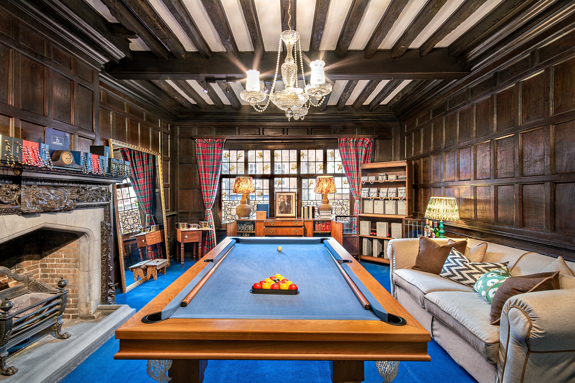
The Oak Room a beautifully complex room with Chesters 2nd oldest fireplace.
The Oak Room: Here's where it became particularly challenging to stay in keeping with the brand. Their other stores are all brighter and lighter. This fitting room featured rich, dark Elizabethan-style wood panelling that absorbed all available light and protected historic features, thereby reducing the in-house lighting options.
The Historic Fireplace: An ornate carved fireplace, the second-oldest in Chester, probably of 15th-16th-century origin, needed to be featured but lay behind an off-centre pool table we couldn't move, and to the side of clothing racks and a dressing screen. It is historic, beautiful, and photographically demanding - all that dark wood and grey stone detail to preserve blacks and shadows whilst lightening the room.
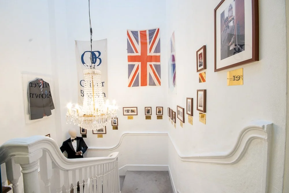
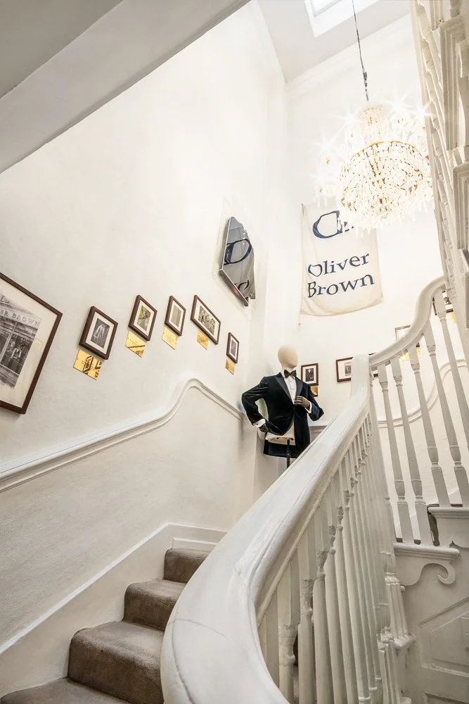
The Staircase: Capturing the late Georgian / early Victorian elegant curve of the bannister whilst showcasing the store’s timeline in framed photography and important memorabilia rising around it… all whilst a chandelier simultaneously blocked the view from most angles... and keeping wide-angle lens distortion out whilst preserving the sweep of the staircase... with blue sky light flooding down the tall ceiling creating additional exposure challenges. It was a puzzling compositional priority to capture.
Potential angle that highlights the space and the blue top light.
Final stair edit from below
Beautiful?
Absolutely.
Easy to photograph to match their modern, fitted, bright, naturally-lit London stores?
Not so much.
The Technical Challenge: Mixed Lighting in a Historic Space
The lighting situation for this photography brief, despite its charming Chester interior period features and partly because of its historic Rows location, was what photographers politely call "complex", and by that, what we actually mean is a “fun” challenge (both literally and figuratively).
We're working with:
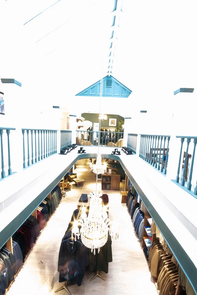
Skylights bringing in dull winter daylight (blue-cast around 5500k, low intensity)
Tungsten spots providing directional accent lighting (yellow-cast warm light around 3200k)
Chandeliers adding ambient warmth and atmosphere (also tungsten, but diffused)
LED displays with varying colour temperatures from warmer to cooler and different again to daylight and tungsten light
Then, as well as blue-yellow lighting variations, additional colour shifts on the green through the magenta spectrum, all pointing in varying directions, bouncing and highlighting. All of this in a cosy space where it’s like the light sources were having a party and a fight, creating colour casts, and illuminating different items at vastly different intensities. And this was despite our best efforts to re-position and point some of the spotlights, to minimise cross-overs.
The goal? Brighten the images to match the London stores' photography whilst retaining the unique details in the architecture, period features, and compact spaces that make this historic Chester location special. It has been ranked as a city more beautiful than Venice after all, attracting tourists into its golden ratio’d richness.
The Shooting Strategy: Setting Up for Successful Editing
Knowing the editing challenges ahead, the shooting strategy had to be methodical:
1. Multiple Exposures: Taking several shots at different exposures of the same composition allowed me to correctly expose both the bright skylit areas and the darker wood-panelled corners. Our eyes naturally adjust as we look around a space, integrating what we see in colours, shadows and highlights in real-time. Eyes are amazing pieces of technology! The camera can't do that in a single exposure, so we capture multiple versions and merge them in post-production.
2. Compositional Choices: From shooting angles designed to minimise or maximise symmetry (or embrace the lack thereof), every frame considered how the space would need to meet brand guidelines whilst celebrating its quirks.
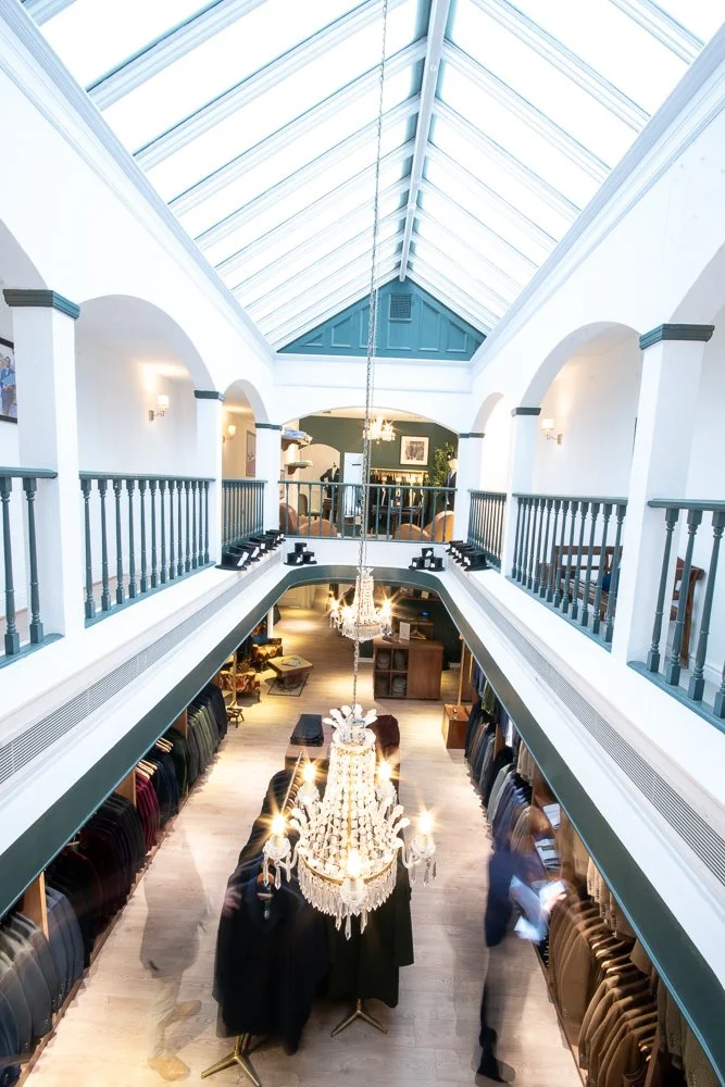
3. Movement Captures: Slow-shutter exposures capturing the shop’s visitors as they browse, through blurred motion shadows creating human yet faceless photography. Artistic, respecting privacy and simplifying business requirements around GDPR and model-releases, whilst removing the clinical empty feel yet maintaining focus on the space itself. Over 7 of these images were used to create the final motion picture.
Highlight Bracket
Midtone Bracket
Shadow Bracket
Final Motion Photo
4. Bracketing for Safety When working with this much lighting variation, I bracket exposures heavily – in some cases 3, 5, 7, or even 9 exposures, sometimes with and without flash to fill shadows. Better to have options in post production than to discover you've clipped highlights or lost shadow detail when it's too late to reshoot.
The Editing Journey: Technical Problem-Solving Meets Brand Alignment
This is where the project shifted from photography to collaborative problem-solving.
The editing process involved multiple edits, further refining the photographs, working with the brand's head office team to ensure the images served their brand needs for all usage purposes and scenarios.
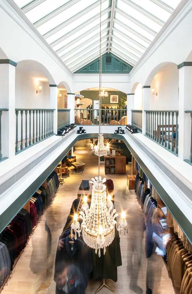
Exposure Balancing: Merging the multiple exposures to create images where both the bright skylit conservatory area and the darker wood-panelled sections showed appropriate detail but without an HDR effect. This meant careful masking, feathering transitions, and ensuring the blends looked natural rather than overly sharp or a fake high-contrast effect. Natural blends are the most time-consuming as it’s meticulous work. However, they're what make images feel real rather than processed.
Shadow Recovery: Lifting the darker areas to achieve a more modern, airy feel whilst retaining enough shadow to maintain real depth and authentic atmosphere. Push too far, and the space looks flat and artificial. Don't push enough, and it doesn't match the brand’s London stores' visual aesthetic.
Colour Grading: This was perhaps the most complex aspect. Bringing unity and balance to the various colour tints and temperature differences, whilst keeping within their visual identity. The green walls needed to retain their signature colour, not murky or mis-toned. The wood panelling needed to feel consistent, not rainbow coloured by every light’s colour-cast. The skylights needed to appear bright without blowing out highlights or appearing too blue-white.
The thing is, in real life, our eyes often don't notice these colour shifts; however, caught on camera, they are glaringly obvious in photographs. Walking through a room, our eyes bounce from object to point of interest, and our vision constantly adjusts with our line of sight. In photographs, every colour cast cries out for attention. Making the images feel as natural as the real-life experience requires careful, nuanced colour work.
Exposures combined before re-touching
Final Image straightened, shadows masked, re-touched light flares and colour balanced
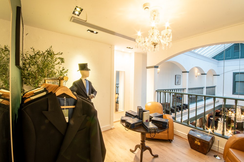
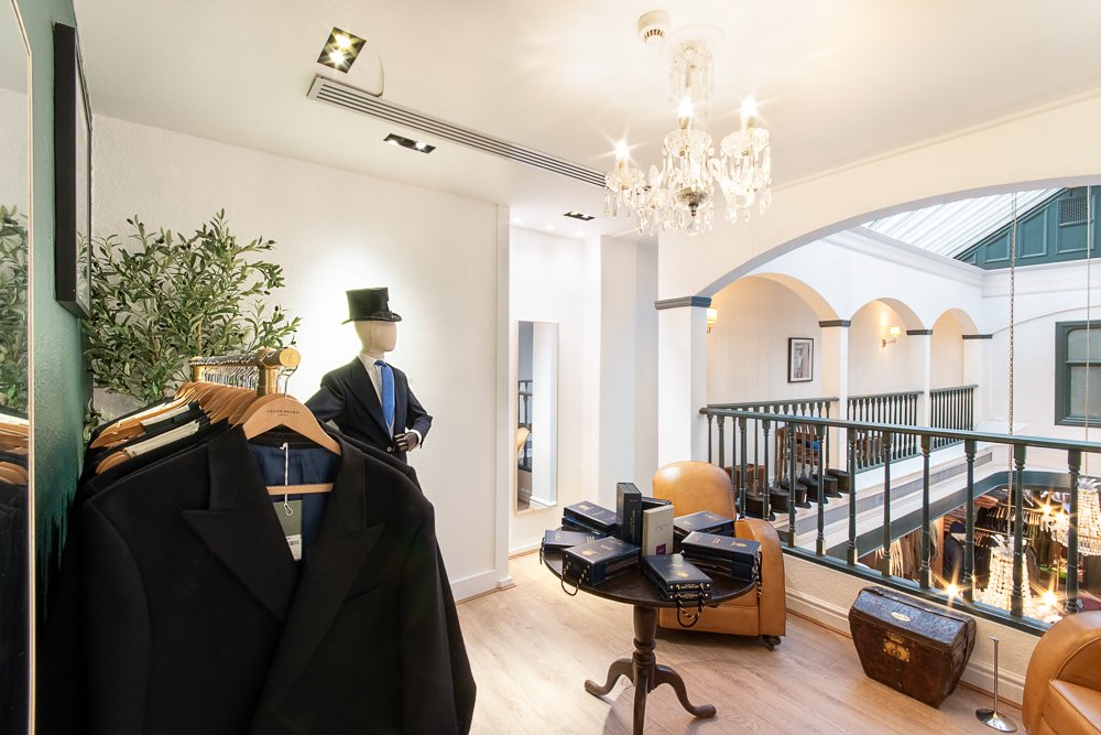
The upstairs balcony room shows this perfectly: the dark suit, mirror reflections, spotlight over the mirror, hallway lights, chandelier, and skylight are all throwing different colours. Bringing out the room’s best, and editing until it looks like the real room without looking fake, edited or like AI generation? That's the work.
Perspective Correction and Straightening: The off-centre skylight and asymmetrical layout meant careful decisions about what to straighten, what to leave slightly angled to feel natural, and how to guide the viewer's eye through the space despite the architectural quirks.
Wide angle distortion
Straighten and lighten

Combined for details, crop, and edit finalised
The staircase presented particular challenges – capturing the artwork arrangement rising alongside it, the elegant sweep of the bannister, all whilst a chandelier blocked most clear angles and the blue ceiling light created exposure issues. Every image required thoughtful perspective work.
Movement Merging: Those slow-shutter captures of browsing customers, when combined, imply activity which shows this is a frequented retail outlet, while focusing on the store, rather than making it about the people.
The Collaboration: Why Communication Matters
Worth noting: this project took more collaboration rounds than initially scoped. As the images progressed through the editing stages, brand requirements became clearer, stakeholder feedback emerged, and the tightrope walk between "brighten it like the other locations" and "feature Chester's unique heritage" required nuanced conversations.
Here’s the thing about commercial photography: The technical stuff is expected. You know, like problem-solving lighting scenarios, shooting settings, editing… Where experience shows up is how you handle curveballs. When the brief evolves mid-project because a higher-up takes an interest, a new team member joins, or the market shifts. When "can you just..." becomes a bigger conversation. We keep our heads and roll with the changes, creating calm in chaos.
We had to converse openly with the marketing project lead to make this possible. Their patience in navigating head office requirements, whilst maintaining our external relationship, created space for us to iterate toward the right solution rather than getting stuck in miscommunication or frustration.
Low Ceilings, mixed lighting, mirrors & dark walls
Beautiful features, skylights and cosy snugs
The Outcome: Brighter, On-Brand, Without removing originality or architectural charm
This commercial photography project in Chester delivered final images that achieve what felt, at the brief stage, like competing goals for retail brand photography:
They're brighter, matching the clean, modern and elegant feel of other locations and fitting straight into the wider marketing materials.
They're on-brand, with colour grading and tonal consistency that aligns with the company's visual identity across all touchpoints.
They're naturally edited, avoiding overly processed or artificial-looking blends, instead maintaining a photographic quality that feels real.
And crucially, they're historically Chester – the heritage of this building on the rows, with its unique historic features such as oak beams, the second oldest fireplace intricately carved, the Victorian skylight, the rich wood panelling, the shop window set back from the street upon the rows, preserved and portrayed rather than badly lit, or edited into another anonymous and generic shop photograph.
What This Project Reinforced
1. Technical Photography Skill Is Expected: Competent commercial photographers can handle mixed lighting, multiple exposure shots, and colour correction. It’s part of the basic job description.
2. Problem-Solving Is the Differentiator: Make a high contrast historic space match bright modern stores whilst keeping character is a brief that separates the competent from the capable.
3. Flexibility Matters More Than F-Stops: Willingness to work through multiple re-edits and refinements, listen to evolving requirements, and find win-win solutions matters even more than technical prowess.
4. Communication Prevents Conflict: Taking the time to listen, talking openly about what's working, what needs tweaking, and why certain choices serve the brand better gets the BEST outcomes.
5. Every Day’s a School Day: This shoot refined our approach to merging exposures for low and mixed light environments whilst keeping images natural. We’re all winning, including you, as we’ve further refined our editing approach!
6. Not Every Style Fits Every Situation: Some looks just won't work in certain locations or light. A bright, airy aesthetic in a dark medieval space? You can get close, but physics has opinions. Talking about trade-offs upfront saves everyone grief (note - we've upgraded this from important to imperative in our workflow!)
Coming Up: The Testimonial
In my next post, I'll share the client testimonial that made this commercial photography collaboration worthwhile – and why feedback matters in professional retail store photography, especially when projects don't follow the straightforward path.
Because "absolutely perfect" sometimes takes a journey to achieve.
Elizabeth Biggs Photography, Training & Consulting Commercial photography | Brand storytelling | Visual strategy 📸 elizabethbiggs.co.uk